C19
The data visualised here are taken from c19.se. Kudos to the IT guys behind this initiative for merging different sources into one easily navigated site. What we do here, is basically some filtering to focus on the regional differences. We apply a one week moving average filter, normalize all figures with the population to get numbers per 100.000 persons, and compare each parameter between the regions. First, a summary in table format of the considered regions, explained as follows:
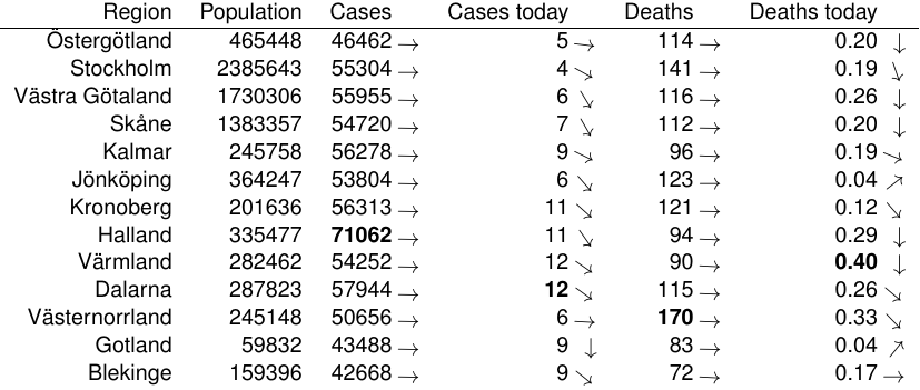
- Cases and Deaths denote the total number to date normalized by the population size. Cases is measured as the number of positive PCR tests.
- Cases today and Deaths today denote the latest reported number.
- ICU and In hospital denote the latest daily report.
- The numbers in bold face denote the highest count within each category
- The arrows indicate the trend of today, comparing with the value two weeks ago, with arrow up meaning (at least) plus 100% and arrow down meaning minus 100% (that is, zero).
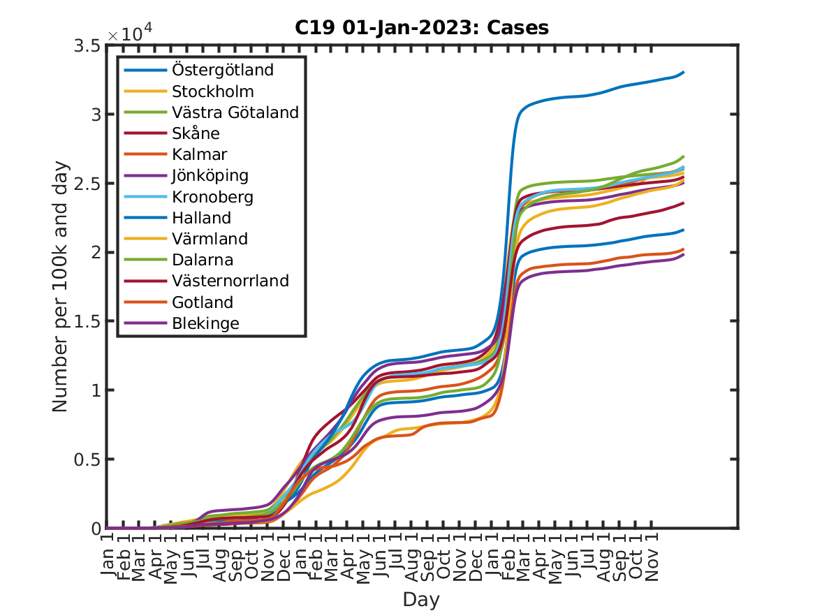
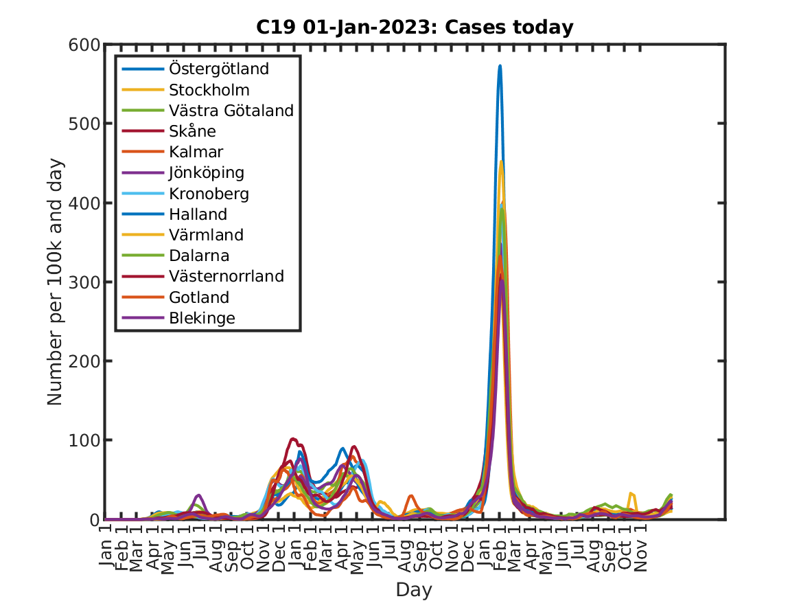
The figures below show the number of cumulative and daily, respectively, cases in selected Swedish regions.
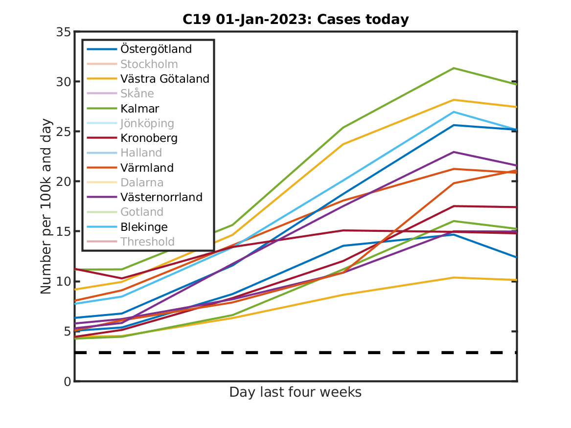
These case numbers are used by our neighbouring countries as a decision variable for border closures. The threshold is computed a bit differently, but it is about 20 cases per 100k and week. The next plot shows the decision variable, which is the two week running average of reported cases, compared to the threshold of 20/7 cases per day (20 per week).
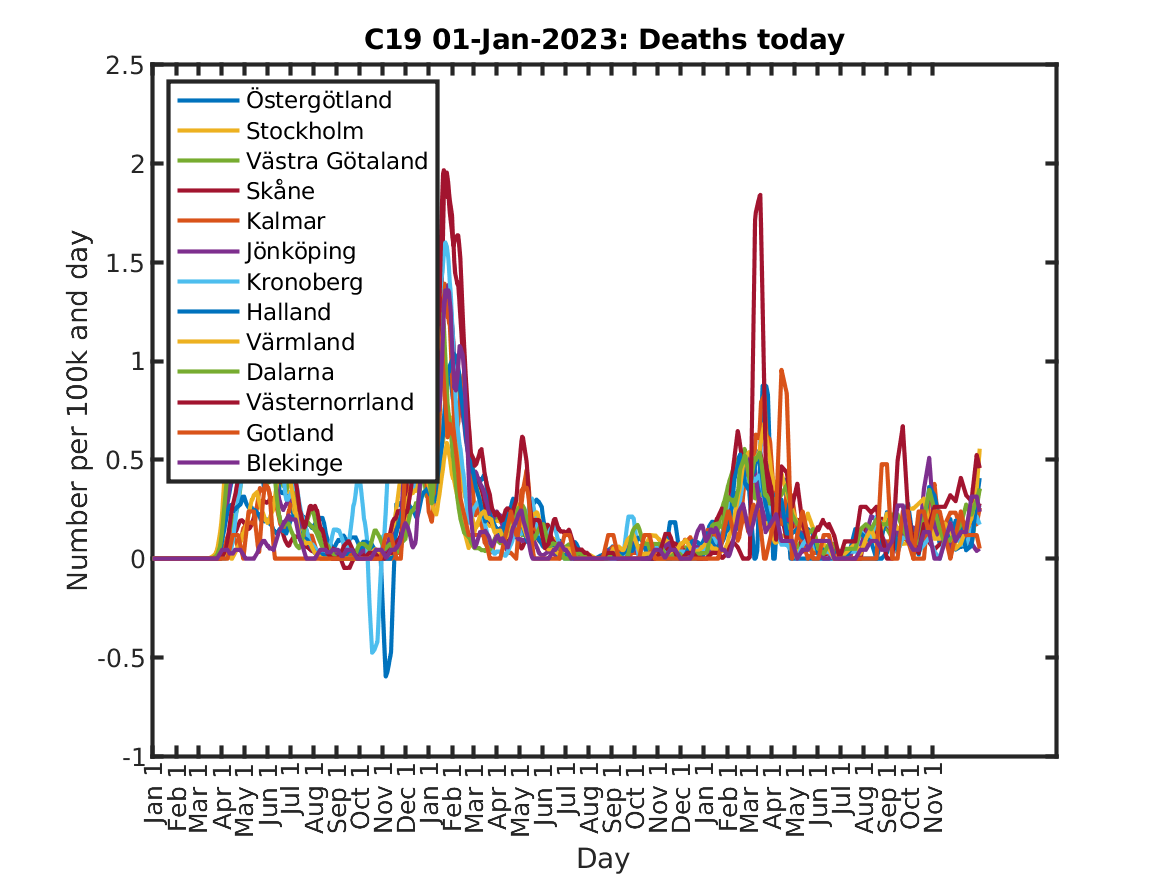
The next figures show cumulative and daily, respectively, mortality.

Further, the figures below illustrate the pressure on the healthcare system. Note that not all regions present this statistics, probably from privacy issues when the amount is quite limited in these regions.

